


Juan Venegas, Senior Data Trainer, Growth Tribe
87%
That’s a percentage that always breaks my heart. 87% of data projects are not put into production.
Many of the failures making up this high percentage are technical (dirty data, unavailable data, etc.), but others are connected to poor communication between data scientists and stakeholders.
To solve this problem, I present a data storytelling framework that helps you communicate data insights.
First, this is a storyline.

This term is often used as a synonym for plot, but some writers literally draw this line and populate it with events to outline their story. What we’ll do is to apply this concept to 6 data examples, so we can see its value in data storytelling.
Example 1: Simple Storyline
Let’s start with a typical storyline for a data project.
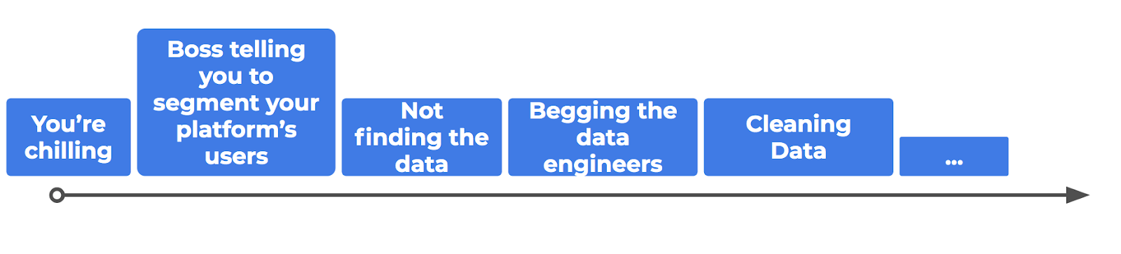
Then comes feature engineering, descriptive analysis, and many other steps.
Making an outline like this isn’t rocket science, but it helps with data science, giving you a global perspective of your project. If you do this before making a single slide, you are way ahead of all those who go straight to PowerPoint.
If you’re reading this article calmly and with a cup of tea in your hand, use the remaining hand to scribble down the steps of your last data project. It’s a good introductory exercise to data storytelling.
What you need to remember about a story is that it has a direction; it’s literally a line we need to find.
Let’s develop this idea with further examples.
Example 2: Starting with why/the result
Oftentimes you need to reassure your audience that your presentation is worth their time, and you need to do it fast. This is why the “start with why” approach, popularised by Simon Sinek, is so successful.
Building from the previous data storyline and adding the “start with why/result” approach, we’d have this:
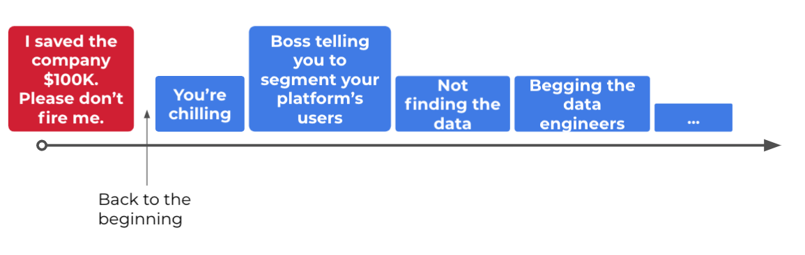
This is a powerful technique and you’re welcome to use it every time. Just remember that there are other options out there. So long as your story’s engaging, your audience will go with it.
For example, let’s say that you dive straight into the hurdles of the project in an engaging way. I want to believe the audience will trust you to show them some good results at the end. At least, it’s my hope that audiences can hold their attention for a few minutes.
Example 3: The Spreadsheet
So far, we’ve covered simple cases, but what happens when we apply the storyline concept to something as data-heavy as a spreadsheet?
First of all, don’t do what I’m about to do.
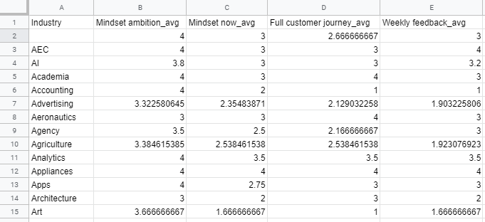
Never show a spreadsheet during a presentation. It contains way too much information. It’ll make your audience search for their way out and stop listening to you.
If you look at a spreadsheet from a storyline perspective, it’s clear why it doesn’t work. This is a surface, not a line. A story needs a direction, and if you haven’t found it, don't expect your audience to do it for you.
So, what do we do? First, let’s understand what we have: in this case, it’s a survey with different questions whose answers range from 1 to 4. The spreadsheet shows the average score for every question per industry.
Second: we need a line to build a story, so we try a horizontal one to guide our audience through the different questions of the survey for just one industry.

If we follow the journey of one industry only (or one row in the general case), we illustrate how the spreadsheet works. And guess what, the audience is clever enough to extrapolate to other industries.
Find that row you like. Turn the columns into steps of the data journey. Get rid of the spreadsheet. You’re now one step closer to data storytelling.
You might wonder, “could I choose a vertical line instead?” You could. In that case, you’re focusing on only one feature and following its evolution across different industries.

However, you may want to plot that column as a bar chart. A graph is not a story, but it also aids comprehension.
If you do this with every column, you’ll have too many bar charts and bore the audience. So, select the most important ones. You won’t be able to describe every single feature in detail, but that’s OK.
Good storytelling takes time, and you should celebrate small victories.
Example 4: Bullet Points
Not all bullet points are created equal.
For example, if you show an agenda like the one below, the storyline is pretty clear: you’re going to talk about one point after another.
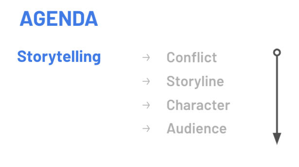
Bullet points aren’t bad as long as the order is clear. After all, the blue boxes we used in the first storyline examples are just fancy bullet points. The same goes for chapters in a book. The problem with bullet points comes when you show something like this in consecutive slides.
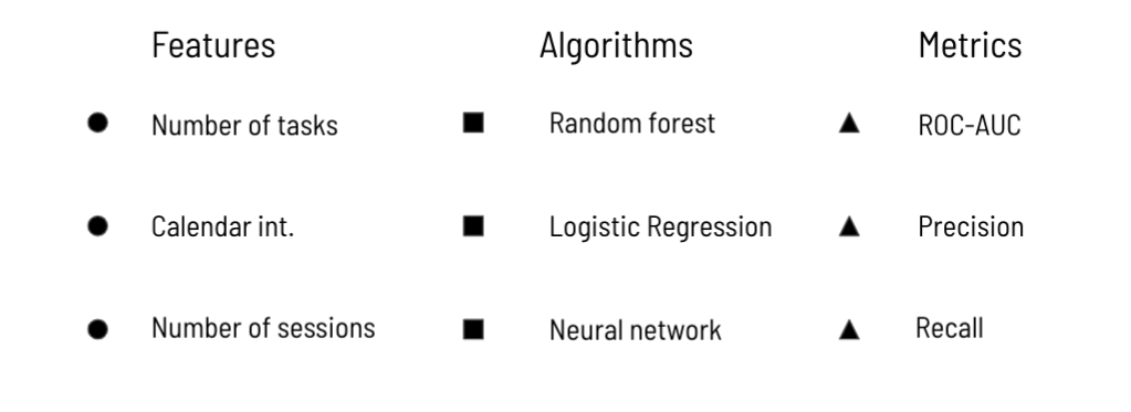
If you’re a data professional, you know how these three lists relate; if you aren’t, you might get a headache. You’re not alone there.
Your brain is trying to make sense of this: how are the features and algorithms connected? Do the metrics apply only to the features or the algorithms? Is there any feedback loop going on? In other words, you’re trying to do this.
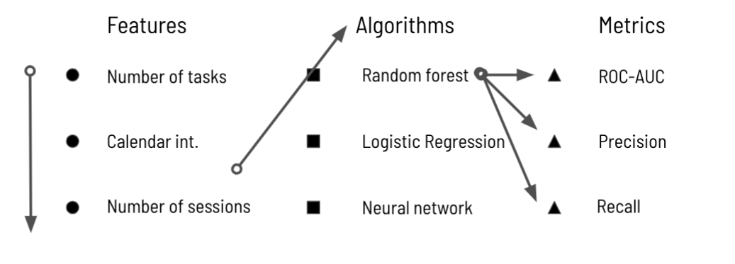
That’s the problem with bullet points in a nutshell: if you don’t give a clear direction to follow, the audience will find no anchor for their attention.
Once again, a story needs a direction, given by the storyline. If you don’t, the audience won't know which way to go, so don’t expect them to find it by themselves.
Example 5: Going deeper into the data
This is one practice that many of my trainees apply unconsciously, and it always works. The idea is to go deeper and deeper into the segmentation of the data.
Let’s say you give a percentage (for example, a churn rate) for the whole population, and then select your paid customers, and within those, the 65-year-olds and older, and within those, the women.
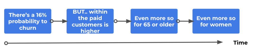
This creates a natural storyline and it’s also great to apply the “but/therefore rule”. This storytelling technique uses these two words as connectors between sentences to give a more conflict-rich flow to a presentation.
You want to avoid a story that goes “this happens… THEN this… THEN that…” Use but/therefore instead. The creators of South Park explain it in this video.
In our case, the churn rate is 16%, BUT this doesn’t apply to all customers equally, THEREFORE we look at the paid versus free customers and find it’s higher in the former group. BUT this rate isn’t the same for all ages, THEREFORE… This is a great way to generate small conflict in the story without dramatising it.
Example 6: Analogies
What about non-linear storytelling? Isn’t that a thing? It is. And you shouldn’t use it until you’re comfortable with a linear narrative. Data is quite complex already, so I wouldn’t recommend non-linear storytelling for data.
However, there are a few exceptions. The first one we’ve seen in example 2, when we started with the ending. Another one is to use an analogy in your story. If you think about it, an analogy is equivalent to opening up a tangent in your storyline.

I like this visualisation because it reminds me to make the analogy run parallel to the data. In other words, what happens in the analogy must mirror what happens in the data. For more on analogies, have a look at this article.
Analogies are a wonderful tool to bridge communication gaps. Just remember to go back to your main story and land your point there, like so:

Always remember to come back to the main storyline. If you take too many tangents, you’ll lose your audience.
In conclusion
Next time you look for a story within your data, remember the storyline and search for it within your data. This visual way of thinking can open up spreadsheets, data tables and complicated diagrams for you. So long as you have a direction, you have a story. Now go and find it.


Latest articles

Boost your Revenue Growth using LinkedIn Social Selling
In a digital age where connections mean everything, leveraging...

The Power of Collaboration: Enhancing Team Performance Tactics
As organisations navigate complex challenges and strive for...
The Ultimate guide to boost organic growth in 2024
Imagine organic growth as the business equivalent of sculpting...
The best 2024 Business Development Guide
What exactly is business development, and how does it differ from...