Data Visualisation: How to Analyse and Effectively Communicate Your Data
There is a last-mile problem that exists in data science. To put it simply, companies aren't getting the value from data science that they originally expected at first. Falling short in the last mile when it comes to explaining the results to decision-makers.
This problem leaves both data scientists and C-level executives frustrated.
To help fix this issue data scientists need to become excellent storytellers. They need to be able to combine data, visuals and a great narrative to persuade an audience to make specific strategic moves.
That's why data communication is so important.
So we are going to take a look at how data scientists can communicate better with stakeholders and master the art of persuasion using data visualisation and storytelling.
Bridging the Data Gap
In order to bridge this gap with decision-makers, data scientists need to upskill themselves and combine their expertise in different key domains such as data querying, analysis and visualisation.
To make sure the data team has the potential to carry out an analysis from data until tangible business impact, we advise to keep in mind the three foundational steps of data science.
What the consultants like to label as advanced analytics.
Advanced Data Analytics
Let's demystify this term.
The first step is descriptive analytics.
Which is all about processing and analysing past data. Trying to answer all the questions on the past. What happened, how many units did we sell? Or how many unique website visitors?
A lot of companies limit their data analysis to this stage. However, they might risk being too slow and reactive, instead of proactive, if they just focus on historical data.
The second step is predictive.
Where we can use different machine learning solutions and forecasting techniques in order to anticipate what could happen next. We can try to predict the future or uncover hidden patterns.
Last but definitely not least comes the prescriptive part.
Or in other words, getting down to business.
This is the stage that requires the most diverse skill set as we need to be able to understand, evaluate, assess and interpret the results of the predictive algorithms.
Moreover, we need to translate all these data insights back to the original business case. And we need to be able to recommend strategic implications and tangible actions to take
Ideally, in an easy, understandable and engaging way so we can grab the attention of key stakeholders and decision-makers.
Data Visualisation and Analysis Tools:
Do you need a framework to get started?
Check out our video about our AI Canvas, which will help you build your first data project from the original business scenario, up to outlining the strategic steps to take after the analysis.
To help your entire process we will give you some tips on data visualisation, which can help you a lot at the descriptive part to understand which data you need to work with.
But also in the prescriptive part when it's time to present your insights and solutions to an audience.
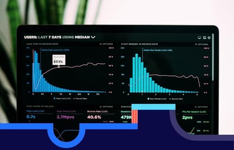
We turn to data visualisation techniques because they can help to understand the information faster, learn better, and remember more easily later on.
There are plenty of options for different tools to visualise data such as Tableau, Power BI Looker or Google Data Studio.
The choice is becoming overwhelming with a lot of great competitors.
In case you struggle to choose the best one for your company we advise you to take a look at Gartner's Magic Quadrant for BI tools where they provide a nice comparison on these tools based on their ability to execute and the completeness of their vision.
If you want to take your visuals to the next level, you must master the art of matching the right chart with the message you want to convey.
Here's a website to help you with that.
You can get some guidance on the right visual you need depending on the type of data you want to represent.
Or the overall purpose of your slide, for example, ranking evolution or distribution, and there is a bonus for each visual.
A typical challenge you may face is choosing between a pie chart or a bar graph when you want to illustrate a category, for example, the country of origin of your customers.
While we see a lot of pie charts use for this scenario, a horizontal bar plot might be more accurate.
On a pie chart, it is difficult to effectively communicate the information or have a quick understanding of the magnitudes of the different categories.
Especially if we try to put all this in 3D, which may give a completely false image on the proportions.
On the other hand with a bar graph, it is far more simple to quickly overview the category labels and also assess the magnitude and compare them to each other.
No matter what the visual is, here are a few tips to follow.
Data Visualisation Tips:
Always start from the original problem. What is the situation you would like to illustrate and what are the key variables in your dataset you use to convey that message?
Next, keep it simple. Do not visualise to confuse, the goal is the opposite, we want to speed up cognition.
Next, always label your axis.
And last, use additional signs and visual cues to help your audience understand the graph.
Data Storytelling:
A data scientist with a visualisation tool is like a child in a candy store. They want to try everything in every colour, and then comes the puking. The data puking. They graph after graph until they bore you to death.
This is where the third element of communication comes in.
They have the data, they have the visuals, but they are missing the narrative - you have to find a story that conveys the results.
If you have a great story that has nothing to do with the numerical findings, you are basically lying, so don't do that. The story must come from the data.
Are you struggling to find the story?
Good, there should be a struggle, conflict is the basis of every story.
And I know what you're thinking, “Oh, I cannot present conflict to my boss, I need to say that I'm amazing. And my team is so supportive, and the project is so ambitious.”
Let me tell you something, you lost your boss already.
Fortunately, storytellers know how to channel conflict into a good structure, we just need to borrow their tools.
The way to design a proper story is to escalate the conflict until we reach a climax.
A moment when the story is resolved and there is a definitive change.
You might have heard of this before, this is the three-act structure:
Act One - you set the conflict
Act Two - you escalate the conflict until there seems to be no way out.
Act Three - you solve the conflict or you die trying.
So we have setting, development and resolution.
Does this look familiar?
This is not far from the three steps to data analytics.
In the first act, you explain how you set the project and describe the data set.
In the second, you predict what's going to happen to your business.
And finally, in act three, you make your business decisions.
Are you still not convinced? Good, because we need the final ingredient. We need somebody to relate to in the story.
Normally, it would be you, but it can also be your team, your company or your clients.
If you are the protagonist of the story, use all the struggles you've been through to make the project work. Don't be pessimistic, acknowledge the victories as well, which will give you nice variations to engage the audience.
For example, let's say you're doing a project about churn. You try to get the data from the warehouse, but you don't have permission, you finally get the data, but they're not clean. You establish the period of your analysis, but then you have to consider seasonality.
Use all those difficulties and how you solve them to create an entertaining story.
Data Visualisation and Storytelling Conclusion:
So these are our three tips.
First, use data, visuals and narrative together visuals to help them understand and a story to engage them.
Second, use the three-act structure to connect to the three steps of data analytics.
And third, have a defined character your audience will root for.
This process will help you solve the last mile problem.
Best of luck with your data visualisation and communication!